Showing posts with label book covers. Show all posts

Tuesday, April 14, 2026

Narnia Bloggin': 2 Narnia books I've added to my collection, and 1 I didn't

previously in this series: The Curious Case of the Odd Omnibus

Following my (oft ignored) rule of posting a new Narnia Bloggin' post after every five posts. 

I went to my local Savers thrift store (dangerous) because I had been emailed a coupon for 30% off books & media (very dangerous), and I have no self control. I found a lot of great books, not least of which were two The Chronicles of Narnia (TCON) copies that I was staggered to find!

Remember me mentioning that Cliff Neilsen updated his digital art TCON covers? I had tentatively thought about collecting them when they eventually turn up in thrift stores etc. in the future, but I never thought I'd find one so soon! These literally just came out last year, and I found The Magician's Nephew (MN) with the new cover showing Polly coming up out of the pond! I like this cover a lot better than the old one, which looked too science fiction-y and scary. The new cover art is more whimsical and fantastical. My only quibble is that I like the position and look of the rings in the old cover better; they don't look as good flattened like that. Also some internet commenter said the 3 rings like that look like a Mickey head, and I can't unsee it. I wish Neilsen had just done 2 rings, 1 yellow and 1 green, interlocking; 3 makes no sense, as only 2 rings per child are used in the book. You can see the comparison of the old and new covers here.


Pretty decent summary, although my inner pedant doesn't like the inaccuracies (Polly was tricked into touching a magical ring which sent her elsewhere, and Digory was forced to go after her to bring her back. This summary is inferring that both kids went on "a daring quest to save a life".) Anyway.

When I went to put MN with the other Cliff Neilsen TCON copies I own, I found that I don't actually have the old MN cover, so it's good I bought this one! For some reason I thought I had them all. I think that if I come across the old MN cover, I may buy it just to have the entire original Cliff Neilsen digital art covers for TCON. It would have to be cheap but in a good condition, though. IDK. I def will buy the rest of the new cover art copies as I come across them in thrift stores and whatnot. 


In my more cover art for TCON blog post, I had shared pretty covers for TCON that I do not own. Halfway between the last 2 big images, I wrote:

I found some pretty medieval-inspired covers that I like a lot, via the C.S. Lewis editions website. To see the other TCON books' covers in that series, click on each book in the main TCON editions webpage. I would def buy these if I saw them at the thrift store etc. in good condition. I love medieval/renaissance-inspired art.  

I never really thought I would come across one of these at my thrift store, as I don't think they were published in the US (the UK, maybe?). But lo and behold, there was The Last Battle (LB) with its beautiful medieval illuminated manuscripts-inspired border and illustrated capitals spelling out NARNIA! This TCON series was published by Lions of HarperCollins in Glasgow, Scotland (I was right!); there seem to have been a couple of variants of these covers, as some of them were tie-ins with the BBC TCON miniseries from the eighties (just the books that the miniseries adapted: LWW, PC, & VotDT). In looking at the other TCON titles in this covers series, it looks like the illustrated borders are the same for all the books, and only the inside illustration changes for each book. 


It's so beautiful. I'm so happy :) This back of book summary is accurate, I feel. 


I did not end up buying and keeping a deluxe edition TCON omnibus after all, as the ones I looked at were all lightly damaged in some way and/or had very uneven page edges, unforgivable for such an expensive deluxe special edition with such pretty painted edges. I realize I hadn't really specified whether I kept the copy I exchanged or not, in that blog post. They all went back. I'll keep an eye out at bookstores for an undamaged copy with even, flat fore edges, but it's not a priority. Ah well. :/

Thursday, January 8, 2026

Narnia Bloggin': The Curious Case of the Odd Omnibus

In my previous Narnia Bloggin' post, I talked myself into buying the $75 deluxe edition of The Chronicles of Narnia omnibus (7 books in 1). I had planned on getting it from Barnes & Noble as I had a $5 credit, but then my price comparison browser plugin alerted me that Amazon had it for $50.60! $25 off is nothing to sneeze at, so from Amazon I got it. 

It's beautiful, and looked just like the one I looked at in Barnes & Noble, except... the fore edges are not even. There are two furrows, one deep and one medium, and a few smaller shallow ones as well, instead of just a flat expanse of page edges like with most books. This matters because the page edges are painted, and the furrows make the design look bad! I have never seen a book with those kinds of page furrows. Additionally, the solid red top and bottom page edges have big white scratches or scuffs where the red has been scratched or scuffed off. 

Here is the Instagram video I made of the imperfections. 


You cannot tell how uneven this is from this picture. Trust me, you could tell in person.

Profile view of the uneven fore edge/page edges. The deepest furrow is on the right.

scratch, bottom of book

scuff, top of book. note the glued pages

I didn't think much of Amazon's packaging of my book; it was just in a box with a plastic large-bubble (the kind the size of 3x5 cards) sheet for padding and otherwise left loose to bang around inside the box with the other thing that was in there. Maybe that's where the scuffs came from? But there was one on each side (top and bottom) of the book...

Naturally I turned to the Amazon reviews. I did a search in the reviews with the keyword "deluxe". Four reviews turned up about the deluxe omnibus edition. Turns out, I'm not the only one disappointed in the quality of my omnibus. 

"See full review" just takes you to the specific webpage for the review. I promise all text is included
Worth noting that they no longer print books with non-acid-free paper; it's standard


I asked for an exchange, marking the copy I received as damaged. A new one arrived, and while it didn't have the scuffs/scratches my first copy did, this one had, if anything, even more uneven page edges with furrows. Also, the dust jacket had come off at some point and been folded down wrong and had its corners dog-eared. (I did not take any pictures.) Clearly, Amazon is able to sell this deluxe omnibus edition at such a low price (comparatively) because all of the copies are lightly damaged in some way. What a shame. I think I'm going to go back to my local Barnes & Noble and inspect their copy/ies in person, and if it looks ok, buy it for full price. Bookshop.org currently has the deluxe omnibus for $69.90 but I'm too afraid to chance it. Ah well. 

Tuesday, November 18, 2025

Narnia Bloggin': the new Chronicles of Narnia covers I've seen in person

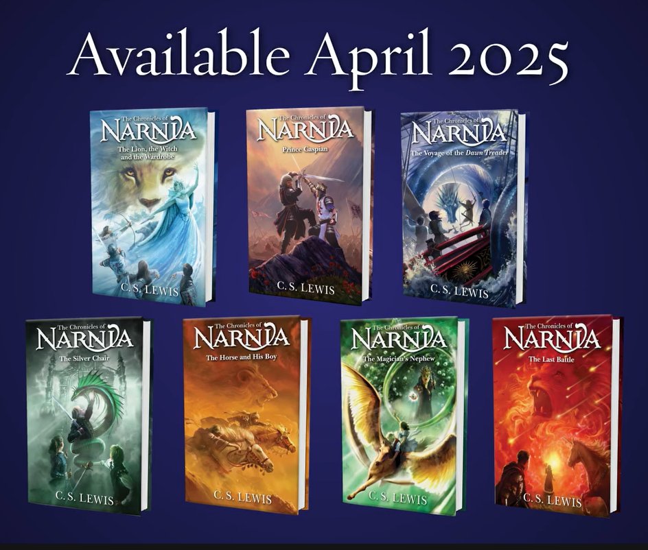
I've been to my local Barnes & Noble a couple of times this year (I try to stay away because it's such a temptation), and naturally I looked at the new individual covers of The Chronicles of Narnia when I was there. I was able to look at The Lion, the Witch, and the Wardrobe (LWW), Prince Caspian (PC), The Horse and His Boy (HHB), The Voyage of the Dawn Treader (VotDT), and The Magician's Nephew (MN). Sadly my B&N didn't have The Silver Chair (SC) or The Last Battle (LB), so I was unable to see those in person. 

The new book covers (art by Owen Richardson) look basically just like what you see online. I'm glad I took pictures of the back covers, as the seller websites I looked at don't seem to post them at all. Obviously you can see the full wraparound cover images here


LWW back cover
 
PC back cover
 
VotDT back cover
 
HHB back cover
 
 
MN back cover

Remember the planetary symbols that Richardson sneaked into the cover illustrations? The one for LWW is covered up due to how the back of the book is formatted. PC, VotDT, and MN's planetary symbols are on the front covers, so you can still see them if you know what to look for. HHB's is on the back cover, but it escapes being covered up by the other back cover elements. I spent way too long looking for the planetary symbol in LB's cover art before looking at NarniaWeb's answer key (at the link above) and realizing that Richardson just put the literal planet Saturn. 🙄 You can read what I think about the whole Planet Narnia thing here

Earlier this month I went back to B&N to look at the super expensive deluxe slipcase edition of the TCON omnibus, only to find they don't carry it in-store. I did find the deluxe edition (still hardcover, no fancy slipcover) and was able to hold it in my hot little hands. I like how it looks, especially the holographic-y cover and painted edges. I didn't think to take the slipcover off (I think it does come off), so I wasn't able to look at the pretty wardrobe design under the slipcover. 

hopefully the video comes out ok. I took it to show the cover's holographic effect

 
omnibus back cover

omnibus sprayed edges

The question is: do I buy the deluxe omnibus ($60-75) since it has the sprayed edges and the pretty wardrobe cover design under the slipcover, which is what I like the most, or do I buy the deluxe slipcase edition omnibus ($150) as it has the nice red velvet slipcover with gold illustrations of Lucy & Tumnus, Aslan's head, and Digory and Polly on pegasus!Fledge, plus the aforementioned painted edges? Do I really want to pay an extra $75 or whatever for a book I'll be hesitant to touch (the spine and slipcover are in red velvet and I cannot touch velvet due to sensory ick)? It's probably not worth it to drop $150 on something I can get most of for $75. If only my Barnes & Noble carried it in person... I would dearly like to look at and touch the deluxe slipcover version. To be quite honest, I don't need another omnibus; I already have 2 paperback ones. I know that if I don't buy one of these, I'll regret it like I regret not getting the Barnes & Noble leatherbound edition omnibus... Ah well, money is made to be spent.

Anyway, you can look at all the current Narnia versions out this year for the 75th anniversary of LWW here: www.narniaweb.com/2025/10/harper-collins-completes-full-catalogue-refresh-for-narnias-75th-anniversary

To read my other Narnia Bloggin' posts, click on the Narnia label at the bottom of this blog post. 

Monday, May 12, 2025

Narnia bloggin': more cover art for The Chronicles of Narnia books

 Previously: the different Chronicles of Narnia covers I collect

There were five blog posts between the first Narnia Bloggin' post and the most recent/second post (linked above), so since five more blog posts have been published since that one, it's time for a new Narnia Bloggin' post. Previously I shared about how I collect various cover art versions of The Chronicles of Narnia (TCON), and whether or not I have the full run of each series. I decided to post about other cover art TCON versions and why I don't collect them as well. The main reasons are: 1) I only have so much shelf space, and 2) I am not made of money.


Original covers with art by Pauline Baynes - you can see what these look like on this website. I like these well enough, but not enough to purchase them. If I were to find a set of these in good condition for a good price, I might buy them. But that is not very likely to happen. Obviously I am not going to buy actual first editions! I once held a first edition of (I think) The Lion, the Witch, and the Wardrobe (LWW) in my hands once; it was in a rare books store in a giant mall in Las Vegas (possibly Bauman Rare Books). It was so cool. As far as I know reprints of the TCON books with these original covers have not been made, although of course other covers with Pauline Baynes' art exist; I own the full-color editions. 

~

PB art circles TCON covers -  The illustrations within each circle are, of course, taken from Pauline Baynes' art. The only one I don't immediately recognize is the one for Prince Caspian (PC); this Reepicheep must have been drawn for one of the many other PB covers and Narnia books she drew for. It does look like her style.

~

image source. pay no attention to the Narnia trivia book

TCON covers by David Wiesner - I actually like these a lot, but not enough to buy them (they feel too... cartoony?). Probably my favorite cover of these is The Magician's Nephew (TMN); having us be able to see a faint reflection of Digory in the silver apple he's holding, plus Jadis hiding behind the tree, is so cool! I think Wiesner's The Voyage of the Dawn Treader (VotDT) is the only copy I can remember seeing that does not have the ship on the cover. 

~

TCON covers by Chris Van Allsburg - You may remember Chris Van Allsburg from his iconic books such as Jumanji, Zathura, and The Polar Express. His art style is so soft yet detailed and interesting; much less dreamy than it initially looks. I like these covers, but again, not enough to buy them. I like that he chose to show the scene where Doctor Cornelius is giving Caspian an astronomy lesson in the high tower for PC's cover; that scene happens towards the beginning of the book, and most covers just show people or boys fighting with swords etc. His VotDT cover is from nearly the end of the book; very beautiful. Having Jewel the unicorn be shown with blood dripping from his horn for The Last Battle (TLB) is a choice and I respect it. 

~

In googling, I just found out about this beautiful collector's edition set from Easton Press. Different colored leather bindings, with one Pauline Baynes illustration from each book done in gold outlines. That price tho! 😭

~

Folio Society TCON sets - Speaking of exorbitant prices, apparently at some point in the nineties the Folio Society made a TCON set in this gorgeous, richly detailed gilt style (possible second similar style). I'm sooooo tempted to get one of the under $300 set... but that would be so financially irresponsible... I'll reassess when I'm 40.

~


Back in the 2000s, Barnes & Noble made a beautiful leatherbound collector's edition TCON omnibus. I didn't buy it because the cover art was LWW themed and I don't like that for TCON omnibuses. I wish I had; it's not available anymore and the resale prices are ridiculous. :'(

~

TCON covers by Steven Lavis - Also from googling, I stumbled on this cover set by Steven Lavis from 1980, possibly from the UK or Canada and almost certainly not published in the US. I like them, especially the additional details at the top of the books above the titles (the wardrobe detail for LWW, etc.). Here's more pictures of the covers as well as the set's slipcover.

~

TCON covers by Julek Heller - There appear to be two versions of Heller's cover art: this TCON set with no border, and this TCON set that has cover art inside frames with a lion & unicorn plus other characters/creatures. For some reason those two TCON sets have different covers for PC and TSC. IMO it doesn't make sense to have the Black Knight on the cover of TSC because he barely comes into the story. The LWW cover is a bit spoilery, and the TMN cover is inaccurate because I believe only Digory sees that giant beautiful bird (the kids don't see it while on pegasusback).

~

Ok, this is different: here's another probably-foreign TCON set, but this set is in three volumes instead of seven or one. The first volume has TMN, LWW, and The Horse and His Boy (HaHB); the second volume has PC and VotDT, and the third volume has TSC and TLB. That's so random; why would they do it like that? The cover art is pretty, even if the children all seem to have the same face and hair.

~

I found some pretty medieval-inspired covers that I like a lot, via the C.S. Lewis editions website. To see the other TCON books' covers in that series, click on each book in the main TCON editions webpage. I would def buy these if I saw them at the thrift store etc. in good condition. I love medieval/renaissance-inspired art.

~

Warwick International Publishing House TCON editions - You can see them all here along with their other offerings since I'm too lazy to link to them individually. They look very pretty, and all have that wardrobe frame thing going like the Dillon's covers. Hang on, is the girl (probably Lucy) on the cover of LWW pointing a glowing magic wand at Aslan???? WTF?? Why is he a giant compared to her? If that were the White Witch (which it does not appear to be), Aslan should definitely not be so huge compared to her. PC just shows the lad; VotDT shows Aslan all big over the ship for some reason; HaHB shows a boy on a horse like usual but unusually he's wearing a royal military uniform, not unlike something an actual prince would wear?? That's a spoiler, wtf. TSC's cover is also unusual; I'm guessing that's supposed to be Rilian sitting on the silver chair with the snake around the top? He looks too young and too asleep; otherwise, good/interesting cover. TMN shows Aslan standing behind Digory, who is not dressed like he should be (whither his Eton collar?). It's pretty but meh. TLB's cover is almost identical to VotDT's, only it's Aslan's head over Cair Paravel (I'm guessing). It's pretty but we basically never go to Cair Paravel in TLB.

~

more TCON covers by Cliff Neilsen - Apparently Cliff Neilsen, who made one of my favorite TCON cover series, also made another set of digital cover illustrations for the TCON series. TBH I had completely forgotten about them until I started googling the covers. All of the covers are too dark and green, in my opinion. The LWW cover is the worst; it's obviously supposed to be Aslan, but he looks like a taxidermied stuffed lion that has gone evil (the red shading doesn't help). The PC cover is fine, if a bit boring; it's just a sword against a tree. VotDT's is a dark, danky silhouette of the Dawn Treader, which I don't really like. TSC's cover just shows a snake, which is boring. HaHB shows 2 crowns, which I think is a spoiler; it's the only HaHB cover I've seen to not show a horse or a scene from the book. TMN has a dark green apple (which is wrong; the apple was silver). TLB is the only other reddish cover and shows a unicorn as well. Overall I do not like this series of cover art at all; the only thing I do like is that these all have C.S. Lewis' signature on them, which I think is interesting. 

I JUST learned that Cliff Neilsen just redid his TCON digital art covers that I love! I thought I was losing my mind while looking at the various covers on B&N, because most of them just look slightly different, with the exception of LWW. I like them; I think TMN is my favorite. NarniaWeb helpfully posted them all with old/new cover comparisons. 

~

via the official Narnia Instagram

I never posted a picture of the new Owen Richardson TCON covers, despite discussing them. I like them, I think. They look dynamic and interesting, if a bit dramatic. I'm not really sure if I'll bother buying them; maybe one at a time via thrift stores etc. like my other TCON editions.

They're also going to come out with a beautiful new collector's edition TCON omnibus. Shut up and take my money!!!

Sunday, March 30, 2025

Narnia bloggin': the different Chronicles of Narnia covers I collect

Previously: the first post in this series

I mentioned previously how I collect multiple editions of The Chronicles of Narnia that have different covers, which I brought up because of the announced upcoming new TCON covers by artist Owen Richardson that I wanted to talk about in my previous Narnia Bloggin' post. That got me thinking about all of the different cover editions of the TCON series that I own, and I decided to turn my Narnia bloggin' post into a series so I can post about all of them. Unless otherwise stated, I collected all of these by looking for them in thrift stores and yard sales and slowly buying them one by one as they turned up. I don't think I paid more than $3-5 for each copy. 


I first read The Chronicles of Narnia at my local public library, and they all mostly had these deeply strange and ugly neon illustrated covers that I nonetheless have a lot of nostalgia for. The cover for The Magician's Nephew (MN) is especially imprinted in my mind, as it was the first Narnia book I ever read. A quick google let me know that these are the 1970 Collier Books set with art by Roger Hane. I picked up from my various readings and Narnia fandom presence that these were made for the American market, although I may not be correct.

For the most part, these covers mostly seem to be the artist's take on scenes from the book, probably inspired by the preexisting inside illustrations by Pauline Baynes, whose illustrations remain inside of all of the different versions of the full Narnia books I've ever seen (even the mostly un-illustrated omnibus retains one of her illustrations to head each chapter). I don't remember if PB actually drew the four Pevensie children going into the wardrobe and Narnia the way Hane has for The Lion, the Witch, and the Wardrobe (LWW), and the cover illustration for MN is drawn from a description of the children and Jadis emerging from a pool in the Wood Between the Worlds (Jadis had indeed grabbed Polly by the hair). The disembodied giant head of Aslan above Shasta and Bree on the cover of The Horse and His Boy (HHB) is, of course, artistic license. Overall, good and accurate covers, if a bit strange. I own all seven.

~

The first Narnia books set I ever owned was the 1990s ones with cover art by Leo and Diane Dillon, a married couple and fantasy & science fiction illustration powerhouses who have illustrated a lot of famous books. I believe the brass-looking wardrobe frame around each cover illustration was made by one or both of them too. I think it's supposed to depict a dryad (?) and a dwarf welcoming you into the wardrobe and Narnia. As a child I received one book for each birthday and Christmas in a four-year span; my parents undoubtedly thought seven books were too many and too expensive to bestow upon me at once. 

MN focuses solely on its antagonist, as does LWW; the rest depict pivotal scenes in their respective books (well, The Voyage of the Dawn Treader [VotDT] depicts the Dawn Treader just sailing on the water, a popular choice for the book). The Dillons' art is very detailed and has a bit of an alien, weird quality. The title areas all having different colors is a good idea to help tell them apart. I highly recommend clicking on the source link below the above image to see the original poster's other pictures of the covers.

~

After the Disney LWW movie I got into the Narnia fandom online and became aware of other book covers. 

One of my favorites is Cliff Neilsen's TCON covers; they're computer illustrated and feel fresh and modern. I especially love the flame lion Aslan that adorns the omnibus


The transparent, scifi-looking elements make the books seem spookier then they (generally) are. Looking at the covers now, they do rather look like products of their times, but I do still like them a lot. The LWW cover is probably my favorite. I own all of these except for The Magician's Nephew, for some reason.

~

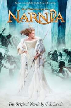
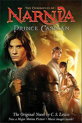
Like most book lovers, I generally disdain movie tie-in book covers, but I did get the ones for the Disney Narnia movies. My mother actually bought me the LWW tie-in Narnia omnibus (the one with the White Witch), which a friend of hers had at her yard sale or something. I did not want to buy it myself because it only depicts art from the first book/movie (the fire Aslan omnibus pictured above is general so it was ok in my opinion). However, a gift is a gift. Owning that omnibus is what made me decide to buy the other movie tie-in covers. 


I genuinely cannot recall which of the two LWW movie covers is the one I have; maybe one is on the LWW omnibus? I cannot recall. I have all of these except for VotDT (I actually just purchased the movie cover Prince Caspian earlier this year). There seem to be a couple of variant covers for each of the movie tie-in books. 

~

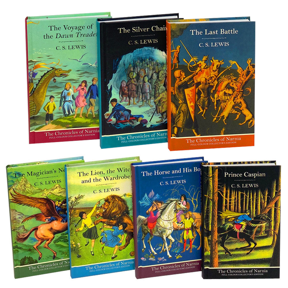
There are many TCON series that have cover art by Pauline Baynes, the original illustrator; at least in the US, her illustrations within the TCON books always remain, regardless of the cover art. The ones I've decided to collect are the full-color collector's editions in paperback (identical to the hardcover ones shown below).


The MN, LWW, HHB, and VotDT covers show idyllic scenes from the books (Aslan did romp with Susan and Lucy, although there was no mention of a daisy chain); the other three books' covers show more suspense. These are good, if a bit precious and of the time. Having the inside illustrations be in full color is very nice, as is the thick glossy paper. My most recent thrift store trip yielded a slightly creased copy of the full-color VotDT, so now I have all of them! 🤩


Obviously, I could track these down and order them online, instead of getting them from the thrift store as they show up, but where's the fun in that? 

AMAZING website I just found in looking up the different covers!!

Tuesday, February 25, 2025

Narnia bloggin'

The Chronicles of Narnia was the first fandom I ever participated in online, having loved the books since I was seven, and it's still very near and dear to my heart (just look at my Instagram handle). I used to be very active on the NarniaWeb forums around the time of the first Disney movie (TCoN: The Lion, the Witch, and the Wardrobe) through probably a bit after the second (TCoN: Prince Caspian) or third (TCoN: The Voyage of the Dawn Treader). More clearly, this was 2005-ish to around 2009/10. It was about the only social life I had at the time, until my last two years of undergrad; I think I was in grad school when I finally stopped reading and posting in the forums for good, although I still think of them and the people I met on there fondly. The NarniaWeb admins still send me a birthday message every year despite me being inactive. 

In terms of how I see the Disney movies, I liked the first one the best (LWW), Prince Caspian the worst, and VotDT the mediumest. There were of course additions to LWW that I didn't like, little remarks and actions for the kids that were annoyingly precious or modern or childish (clearly added to up the drama and cater to modern American audiences), and the (IMO) unnecessary waterfall scene. I was most active in the NarniaWeb forums during the making of Prince Caspian, poring over and freaking out about movie news for probably a year and a half with other die-hard Narnia fans, which whipped me into a frenzy probably no movie could have lived up to. Prince Caspian, which strayed even farther from the source material than its predecessor and was given even more unnecessary and egregious additions such as the Susan/Caspian kiss (I shudder and C.S. Lewis rolls in his grave), was a huge let-down that disappointed me greatly. I was busier during VotDT's making, not reading or participating in the forums as much, partially because of school, having IRL friends, and due to the disappointment I had incurred. I enjoyed VotDT more because of this; if you expect nothing, there is room to be pleasantly surprised. I heard from my most recent CSL class professor that CSL's stepson put a stop to the Disney Narnia movies after the third because he felt they were straying too far from the Christianity of the books (my professor knows him personally). I of course would have liked to see more Narnia books turned into movies, but understand fully. He was right to do so, I think.

All this is to say: I've heard that Netflix is going to make new Narnia movies and possibly a TV show/s. This of course makes me a bit nervous but rather intrigued. Greta Gerwig is going to be the director, which I'm not totally on board with but trying to have an open mind about. I liked Lady Bird okay, liked Little Women quite a lot, and loved Barbie, but I'm not sure how her brand of feminist introspective teen-girlhood and young womanhood is going to fare. TCON has a few strong, well-rounded female characters, but they do not spend any time thinking about what it means to be a teenage girl/young woman in society and the way cultural and parental expectations effect their attempts to be themselves and live their lives the way they want. The closest to do so was Susan, and look where that got her. I didn't like Disney/Walden's attempt at this (introspective teen-girlhood), which consisted of having Susan be awkwardly talked to by a boy in the beginning of Prince Caspian, much to her dislike; this was clearly supposed to be a foil or something for her "relationship" with Caspian, which was barely (and badly) developed anyway. I'm not sure what the point of it was (the boy trying to talk to her in England); was it to show how Susan preferred muscular hot older guys to nerdy skinny boys? Was it an attempt to show character growth and maturing (Susan didn't like boys and then she did)? Was this their attempt at laying groundwork for what happens to Susan at the end of the series??? 

While typing this, I just remembered how they added a character to VotDT (a sailor's young daughter who stowed away on the ship to be with her dad) in order for the film to have another female character besides Lucy and the star's daughter (who is there for five seconds and isn't even named in the book) and to pass the Bechdel test, lol. I know the books are just so male, and there's not really a way to change that in a way that will keep everyone happy (far from it). IMO, the best way to do it is to make some minor characters female. Doctor Cornelius could be Doctor Cornelia, the seven lords Caspian tries to find in VotDT could be the seven lords and ladies, etc. This will make a lot of people angry but who cares. I'm sure the diversity that was "added" to the background characters made people upset; look at the blowback the current LOTR prequel TV show got for their Afrolatino elf (whom I love of course). As the books are set during the 1940s in our world and a classic fantasy European medieval era-inspired world, plus were written in the 1950s, there are period-typical attitudes towards gender roles. I'm curious to see how Greta Gerwig deals with these without making the changes too focus-pulling.

The Disney/Walden movies' director, Andrew Adamson, put in his boyish love of the battles and fighting in the Narnia books, expanding and inflating them to mythic LOTR-like proportions. I obviously feel the battles and fighting and war etc. have their place, but it was unnecessary to inflate them and add more; this made the movies feel like kiddie-LOTR or LOTR-lite. There are as many views of Narnia as there are readers, I guess. I personally liked the fantasy and magic stuff the best, as well as the history that is only hinted at but never fully told. I know Greta Gerwig loved the TCON books as a kid, as did most of us; hopefully the adaptations she helms will be balanced and not too much of anything.

I do think it makes sense to turn Voyage of the Dawn Treader into a TV show; the stories are very episodic anyway and would translate nicely into TV episodes. The Silver Chair would also work decently well as a TV show, as would The Last Battle. The other books, I feel, would not, although LWW and PC have of course already been turned into BBC miniseries (TV shows with only one series, usually of 4-6 episodes) as well as movies. 

One thing I am really looking forward to is new Narnia merch. When the Disney movies came out, I was in college and had very little money, so I couldn't buy everything I wanted to. This time I have plenty of money to spend on frivolities, but my fear is that Netflix won't put out any official Narnia merch. I can't recall seeing any official merch for most Netflix shows, apart from a few shows' merch on Hot Topic/Boxlunch. Well, there's always fan-made merch. 

~

A new set of illustrated covers for the TCON books were announced; they remind me a lot of Cliff Nielsen's excellent cover illustrations as they're both dynamic and computer/digitally illustrated, only the new ones look extra dramatic. I mostly liked them, until someone online pointed out that they look AI-generated, and my stomach sank. After scouring them and finding Digory's case of AI-hand, I commented on the official Narnia Instagram post about the covers asking if they were AI-generated, and both the artist and his daughter replied that they were not (kind of embarrassing but I did comment somewhere very visible, so). I do kind of agree with some of the other comments that all fantasy covers look kind of the same nowadays. I don't think I'll buy a set of the new covers books brand-new, unless I find a great deal or something, and my guess is that it'll take a few years after they are published for copies with these covers to make their way to thrift stores and secondhand bookshops if I want to buy them the way I've bought the others (aka individually and slowly depending on what the thrift stores have at the time).

I was intrigued by the artist adding Easter eggs to the cover illustrations in the form of the planetary symbols for the planet each book falls under according to Michael Ward and his Planet Narnia/seven heavens theory. I don't subscribe to it but I was brought much closer to agreement by a classmate's presentation on that theory in my CSL class (Dr. Ward also gave a presentation on his planetary theory to my CSL class since my professor knows him as well). For Owen Richardson (the new book covers' artist) to use the books' assigned (by Dr. Ward) planetary symbols show that he loves the Narnia books enough to read books about them; I am comforted by this knowledge.

Someone else pointed out online that they're using the Disney logo/font for the new books' titles, and won't that look dated, especially by the time the Netflix movies come out? I like the Disney font a lot but I rather agree; it'll be cool to see what Netflix does with the titles design.

Monday, September 9, 2013

TIFITLWIW: Horses roundup (heh)

I was going through the pictures on my phone and realized a good amount of them involved horses. So I thought I'd put them together in a post.
This is by Carol Cable, from a funny book of her cartoons about academe. I saw this and immediately thought of Tumblr.

I saw this and immediately thought of one of my favorite shows. Parks & Recreation takes place in Pawnee, Indiana. There is a Native American tribe on that show, but they are the Wamapoke (sp?) rather than the Pawnee tribe.

This is a funny little horse doodle I found on the back of a book jacket.


Often hardcover books that come with dust jackets will have a publisher's logo or something indented into the book cover (there's a specific term for this I think, like 'stamped' or something, but I don't know what it is). This one's a horse and the initials of the author, who I think is known for writing books about horses. The book (which I just spent like 15 minutes looking for) is The Man Who Listens to Horses by Monty Roberts. I took a pic of this because my initials are MR as well.

Friday, July 26, 2013

TIFITLWIW: Don't judge a book by its cover

Book covers are very important to me. When I'm buying series, they all must have the same cover. I have the three Howl's Moving Castle books, but two have these  covers and one (the middle one, which makes it worse) has this one. It drives me nuts (I think at least one was a gift, and/or I couldn't find the last one with the proper cover and I didn't want to wait to read it). But I don't want to spend extra money to replace it. #firstworldproblems

Anyway, I came across some books with, shall we say, interesting covers.


Quick, guess what this book is about! Well, there's a sword and a flower, plus that font and color choices... Maybe it's a historical bodice-ripper romance novel? Well, I don't know about the romance, but judging by the book's Wikipedia entry, it's a historical novel about ancient Rome. It does not sound like it matches the cover at all.

Check this guy out too:

I know Chaim Potok as the author of The Chosen (I saw the movie but haven't read anything by him), so I know it's probably a great work of fiction. This cover kinda sucks though. It's just so painfully Eighties. Like, if this cover had a lady on it in addition to the pensive main guy, I'd assume it was another one of those White Couple With Tragic Love and Angst books. However, I opened it to find...
It was signed by the author. Cute this face again.

Friday, April 26, 2013

Things I've found in the library where I work: Random book covers

#swag #plaid #palebluegrandpajeans
 
This cover delights me. Not sure why I like Don Knotts since I don't think I've seen anything he's in (I had to Wikipedia him), but how can you look at that face and not (like him, that is). What a swell human.

Henry James on Italy, with the most beautiful paintings of Venice and Rome and such. Haven't tried reading this one because I might burst into tears from missing Italy so much. Also pictured: my Macbook with its purple keyboard cover, some boxes.

Isn't this a lovely cover? There's awesome little medieval-type people representing the different disciplines in each round curlicue thing. I love old books.