Showing posts with label art. Show all posts

Monday, May 12, 2025

Narnia bloggin': more cover art for The Chronicles of Narnia books

 Previously: the different Chronicles of Narnia covers I collect

There were five blog posts between the first Narnia Bloggin' post and the most recent/second post (linked above), so since five more blog posts have been published since that one, it's time for a new Narnia Bloggin' post. Previously I shared about how I collect various cover art versions of The Chronicles of Narnia (TCON), and whether or not I have the full run of each series. I decided to post about other cover art TCON versions and why I don't collect them as well. The main reasons are: 1) I only have so much shelf space, and 2) I am not made of money.


Original covers with art by Pauline Baynes - you can see what these look like on this website. I like these well enough, but not enough to purchase them. If I were to find a set of these in good condition for a good price, I might buy them. But that is not very likely to happen. Obviously I am not going to buy actual first editions! I once held a first edition of (I think) The Lion, the Witch, and the Wardrobe (LWW) in my hands once; it was in a rare books store in a giant mall in Las Vegas (possibly Bauman Rare Books). It was so cool. As far as I know reprints of the TCON books with these original covers have not been made, although of course other covers with Pauline Baynes' art exist; I own the full-color editions. 

~

PB art circles TCON covers -  The illustrations within each circle are, of course, taken from Pauline Baynes' art. The only one I don't immediately recognize is the one for Prince Caspian (PC); this Reepicheep must have been drawn for one of the many other PB covers and Narnia books she drew for. It does look like her style.

~

image source. pay no attention to the Narnia trivia book

TCON covers by David Wiesner - I actually like these a lot, but not enough to buy them (they feel too... cartoony?). Probably my favorite cover of these is The Magician's Nephew (TMN); having having us be able to see a faint reflection of Digory in the silver apple he's holding, plus Jadis hiding behind the tree, is so cool! I think Wiesner's The Voyage of the Dawn Treader (VotDT) is the only copy I can remember seeing that does not have the ship on the cover. 

~

TCON covers by Chris Van Allsburg - You may remember Chris Van Allsburg from his iconic books such as Jumanji, Zathura, and The Polar Express. His art is so soft yet detailed and interesting; much less dreamy than it initially looks. I like these covers, but again, not enough to buy them. I like that he chose to show the scene where Doctor Cornelius is giving Caspian an astronomy lesson in the high tower for PC's cover; that scene happens towards the beginning of the book, and most covers just show people or boys fighting with swords etc. His VotDT cover is from nearly the end of the book; very beautiful. Having Jewel the unicorn be shown with blood dripping from his horn for The Last Battle (TLB) is a choice and I respect it. 

~

In googling, I just found out about this beautiful collector's edition set from Easton Press. Different colored leather bindings, with one Pauline Baynes illustration from each book done in gold outlines. That price tho! 😭

~

Folio Society TCON sets - Speaking of exorbitant prices, apparently at some point in the nineties the Folio Society made a TCON set in this gorgeous, richly detailed gilt style (possible second similar style). I'm sooooo tempted to get one of the under $300 set... but that would be so financially irresponsible... I'll reassess when I'm 40.

~


Back in the 2000s, Barnes & Noble made a beautiful leatherbound collector's edition TCON omnibus. I didn't buy it because the cover art was LWW themed and I don't like that for TCON omnibuses. I wish I had; it's not available anymore and the resale prices are ridiculous. :'(

~

TCON covers by Steven Lavis - Also from googling, I stumbled on this cover set by Steven Lavis from 1980, possibly from the UK or Canada and almost certainly not published in the US. I like them, especially the additional details at the top of the books above the titles (the wardrobe detail for LWW, etc.). Here's more pictures of the covers as well as the set's slipcover.

~

TCON covers by Julek Heller - There appear to be two versions of Heller's cover art: this TCON set with no border, and this TCON set that has cover art inside frames with a lion & unicorn plus other characters/creatures. For some reason those two TCON sets have different covers for PC and TSC. IMO it doesn't make sense to have the Black Knight on the cover of TSC because he barely comes into the story. The LWW cover is a bit spoilery, and the TMN cover is inaccurate because I believe only Digory sees that giant beautiful bird (the kids don't see it while on pegasusback).

~

Ok, this is different: here's another probably-foreign TCON set, but this set is in three volumes instead of seven or one. The first volume has TMN, LWW, and The Horse and His Boy (HaHB); the second volume has PC and VotDT, and the third volume has TSC and TLB. That's so random; why would they do it like that? The cover art is pretty, even if the children all seem to have the same face and hair.

~

I found some pretty medieval-inspired covers that I like a lot, via the C.S. Lewis editions website. To see the other TCON books' covers in that series, click on each book in the main TCON editions webpage. I would def buy these if I saw them at the thrift store etc. in good condition. I love medieval/renaissance-inspired art.

~

Warwick International Publishing House TCON editions - You can see them all here along with their other offerings since I'm too lazy to link to them individually. They look very pretty, and all have that wardrobe frame thing going like the Dillon's covers. Hang on, is the girl (probably Lucy) on the cover of LWW pointing a glowing magic wand at Aslan???? WTF?? Why is he a giant compared to her? If that were the White Witch (which it does not appear to be), Aslan should definitely not be so huge compared to her. PC just shows the lad; VotDT shows Aslan all big over the ship for some reason; HaHB shows a boy on a horse like usual but unusually he's wearing a royal military uniform, not unlike something an actual prince would wear?? That's a spoiler, wtf. TSC's cover is also unusual; I'm guessing that's supposed to be Rilian sitting on the silver chair with the snake around the top? He looks too young and too asleep; otherwise, good/interesting cover. TMN shows Aslan standing behind Digory, who is not dressed like he should be (whither his Eton collar?). It's pretty but meh. TLB's cover is almost identical to VotDT's, only it's Aslan's head over Cair Paravel (I'm guessing). It's pretty but we basically never go to Cair Paravel in TLB.

~

more TCON covers by Cliff Neilsen - Apparently Cliff Neilsen, who made one of my favorite TCON cover series, also made another set of digital cover illustrations for the TCON series. TBH I had completely forgotten about them until I started googling the covers. All of the covers are too dark and green, in my opinion. The LWW cover is the worst; it's obviously supposed to be Aslan, but he looks like a taxidermied stuffed lion that has gone evil (the red shading doesn't help). The PC cover is fine, if a bit boring; it's just a sword against a tree. VotDT's is a dark, danky silhouette of the Dawn Treader, which I don't really like. TSC's cover just shows a snake, which is boring. HaHB shows 2 crowns, which I think is a spoiler; it's the only HaHB cover I've seen to not show a horse or a scene from the book. TMN has a dark green apple (which is wrong; the apple was silver). TLB is the only other reddish cover and shows a unicorn as well. Overall I do not like this series of cover art at all; the only thing I do like is that these all have C.S. Lewis' signature on them, which I think is interesting. 

I JUST learned that Cliff Neilsen just redid his TCON digital art covers that I love! I thought I was losing my mind while looking at the various covers on B&N, because most of them just look slightly different, with the exception of LWW. I like them; I think TMN is my favorite. NarniaWeb helpfully posted them all with old/new cover comparisons. 

~

via the official Narnia Instagram

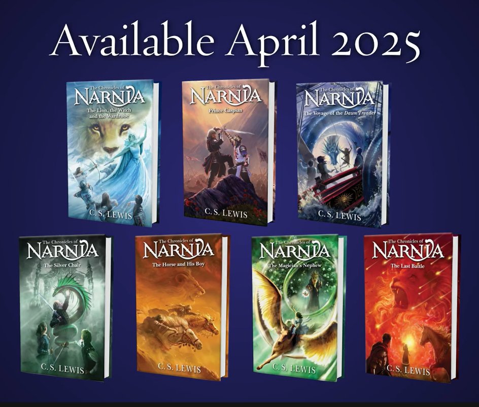
I never posted a picture of the new Owen Richardson TCON covers, despite discussing them. I like them, I think. They look dynamic and interesting, if a bit dramatic. I'm not really sure if I'll bother buying them; maybe one at a time via thrift stores etc. like my other TCON editions.

They're also going to come out with a beautiful new collector's edition TCON omnibus. Shut up and take my money!!!

Sunday, March 30, 2025

Narnia bloggin': the different Chronicles of Narnia covers I collect

Previously: the first post in this series

I mentioned previously how I collect multiple editions of The Chronicles of Narnia that have different covers, which I brought up because of the announced upcoming new TCON covers by artist Owen Richardson that I wanted to talk about in my previous Narnia Bloggin' post. That got me thinking about all of the different cover editions of the TCON series that I own, and I decided to turn my Narnia bloggin' post into a series so I can post about all of them. Unless otherwise stated, I collected all of these by looking for them in thrift stores and yard sales and slowly buying them one by one as they turned up. I don't think I paid more than $3-5 for each copy. 


I first read The Chronicles of Narnia at my local public library, and they all mostly had these deeply strange and ugly neon illustrated covers that I nonetheless have a lot of nostalgia for. The cover for The Magician's Nephew (MN) is especially imprinted in my mind, as it was the first Narnia book I ever read. A quick google let me know that these are the 1970 Collier Books set with art by Roger Hane. I picked up from my various readings and Narnia fandom presence that these were made for the American market, although I may not be correct.

For the most part, these covers mostly seem to be the artist's take on scenes from the book, probably inspired by the preexisting inside illustrations by Pauline Baynes, whose illustrations remain inside of all of the different versions of the full Narnia books I've ever seen (even the mostly un-illustrated omnibus retains one of her illustrations to head each chapter). I don't remember if PB actually drew the four Pevensie children going into the wardrobe and Narnia the way Hane has for The Lion, the Witch, and the Wardrobe (LWW), and the cover illustration for MN is drawn from a description of the children and Jadis emerging from a pool in the Wood Between the Worlds (Jadis had indeed grabbed Polly by the hair). The disembodied giant head of Aslan above Shasta and Bree on the cover of The Horse and His Boy (HHB) is, of course, artistic license. Overall, good and accurate covers, if a bit strange. I own all seven.

~

The first Narnia books set I ever owned was the 1990s ones with cover art by Leo and Diane Dillon, a married couple and fantasy & science fiction illustration powerhouses who have illustrated a lot of famous books. I believe the brass-looking wardrobe frame around each cover illustration was made by one or both of them too. I think it's supposed to depict a dryad (?) and a dwarf welcoming you into the wardrobe and Narnia. As a child I received one book for each birthday and Christmas in a four-year span; my parents undoubtedly thought seven books were too many and too expensive to bestow upon me at once. 

MN focuses solely on its antagonist, as does LWW; the rest depict pivotal scenes in their respective books (well, The Voyage of the Dawn Treader [VotDT] depicts the Dawn Treader just sailing on the water, a popular choice for the book). The Dillons' art is very detailed and has a bit of an alien, weird quality. The title areas all having different colors is a good idea to help tell them apart. I highly recommend clicking on the source link below the above image to see the original poster's other pictures of the covers.

~

After the Disney LWW movie I got into the Narnia fandom online and became aware of other book covers. 

One of my favorites is Cliff Neilsen's TCON covers; they're computer illustrated and feel fresh and modern. I especially love the flame lion Aslan that adorns the omnibus


The transparent, scifi-looking elements make the books seem spookier then they (generally) are. Looking at the covers now, they do rather look like products of their times, but I do still like them a lot. The LWW cover is probably my favorite. I own all of these except for The Magician's Nephew, for some reason.

~

Like most book lovers, I generally disdain movie tie-in book covers, but I did get the ones for the Disney Narnia movies. My mother actually bought me the LWW tie-in Narnia omnibus (the one with the White Witch), which a friend of hers had at her yard sale or something. I did not want to buy it myself because it only depicts art from the first book/movie (the fire Aslan omnibus pictured above is general so it was ok in my opinion). However, a gift is a gift. Owning that omnibus is what made me decide to buy the other movie tie-in covers. 


I genuinely cannot recall which of the two LWW movie covers is the one I have; maybe one is on the LWW omnibus? I cannot recall. I have all of these except for VotDT (I actually just purchased the movie cover Prince Caspian earlier this year). There seem to be a couple of variant covers for each of the movie tie-in books. 

~

There are many TCON series that have cover art by Pauline Baynes, the original illustrator; at least in the US, her illustrations within the TCON books always remain, regardless of the cover art. The ones I've decided to collect are the full-color collector's editions in paperback (identical to the hardcover ones shown below).


The MN, LWW, HHB, and VotDT covers show idyllic scenes from the books (Aslan did romp with Susan and Lucy, although there was no mention of a daisy chain); the other three books' covers show more suspense. These are good, if a bit precious and of the time. Having the inside illustrations be in full color is very nice, as is the thick glossy paper. My most recent thrift store trip yielded a slightly creased copy of the full-color VotDT, so now I have all of them! 🤩


Obviously, I could track these down and order them online, instead of getting them from the thrift store as they show up, but where's the fun in that? 

AMAZING website I just found in looking up the different covers!!

Sunday, April 12, 2020

Rest of March books

So the whole coronavirus thing happened, and I learned that I only blog regularly to procrastinate at work. I also have not been reading more, despite having all this time at home. I did rearrange my square cube bookcase though. It's now between my living and office spaces, and it's perfect as a divider because I have my rainbow books on one side, and my DVDs and CDs and other things on the other side that faces my office.


I purchased and read Daniel Lavery's memoir Something That May Shock and Discredit You in the same week (!!!), which never happens (I won and used an Amazon giftcard). I've loved Lavery's writing ever since the old The Toast days, and will read everything he writes. I loved all the Bible references which he used as descriptive parallels to his transitioning (Jacob wrestling with God and being given a new name, etc.). He also did several of his signature retellings/reimaginings of classical poetry and literature. This book was funny and poignant and I liked it very much. 4 out of 5 stars.
       Trigger warnings for this book: dysphoria, transphobia, Bible passages, depression and anxiety, I don't remember if he mentions his dad enabling a pedophile but if he does that's definitely one


I decided to get over my reading slump by reading an easy children's book, Oddfellow's Orphanage by Emily Winfield Martin (who also illustrated it). It's an early chapter book about a little albino girl who comes to an orphanage, and all the other children and staff that she comes to know there. It's a very gentle, retro and fantasy flavored story, with hints of sadness as of course the children are all orphans. I followed Winfield Martin's art blog, The Black Apple, for years, and I remember the individual portraits of the characters from years ago. She did all the portraits, then came up with a story to tie them all together. These portraits, along with a short biography, are at the beginning of each chapter. I don't actually know her, but I'm very proud of her for becoming a children's book writer and illustrator. I hope she writes more Oddfellow's Orphanage books, as I loved living in the world of the book. Highly recommended for children who can handle a bit of sadness in a book (some of the orphans' families were murdered, and the character bios say so in a non-descriptive but straightforward way). 4.5 out of 5 stars.
       Trigger warnings for this book: murder mentions, death mentions, grief, a character has a brief aggressive episode where he cuts off a girl's braid without her consent

Tuesday, July 23, 2019

Book reviews: June and July

The only book I read in June was Good Omens by Terry Pratchett and Neil Gaiman, which was a reread. I watched the Amazon Prime series (booo. I used my mom's account), read the book, then watched it again. It's so good; I really recommend it even if you don't watch the show. For those of you who don't know, it's about the looming apocalypse and the angel and demon who become friends while trying to make the world better/worse, attempting to stop it. This is difficult because they lost the antichrist, and their respective sides definitely want the apocalypse to happen. There's also a witch and many prophecies. It does get rather close to being too sacrilegious for yours truly, but the humor and relationships make up for it. I felt the show was a perfect adaptation of the book, due in no small part to Neil Gaiman's influence and work as a show runner. 4.5/5 stars, keeping obviously.


On Sunday I went to Savers and bought like $40 worth of books. They have a buy 4, get 1 free deal which gets me almost every time. I started reading books from my haul pretty much immediately, starting with Which Witch? by Eva Ibbotson, which is about a magic contest hosted by a wizard who needs to find a witch to marry. Ibbotson wrote the suspiciously Harry Potter-esque The Secret of Platform 13 (it was written long before HP), which I read a few years ago, and her writing is very good. It's that rather old-fashioned British fantasy children's lit that I like so much, very Dahl-esque. I noted there was another "orphan boy who at first was presumed to be ordinary but is actually More" character. I definitely recommend this if you like/don't mind reading about witches and wizards (they're written for a child audience). 4/5 stars, but I'll be giving this one away


The next book I read from my Savers haul was Girl in Hyacinth Blue, which is a series of interconnected short stories about the different people who own a possible Vermeer painting throughout the centuries, and what it means to them and how it affects them and their lives. Quite sad, but very good writing. It turns out I had read the first story before, which is about a math professor who kept the painting a secret in order to keep people from finding out his father was a Nazi who acquired the painting by looting a Jewish home. I think I read that in high school or college. My favorite (i.e. least sad) story was the one about the Rococo-era rich lady who had to sell the painting without its authenticity papers in order to flee her cheating/cheated husband, thus ensuring future owners were unsure it was a real Vermeer. I love the Rococo era, and the despair and hardship the other characters went through was not present in this story because the lady was rich. I did some googling, and the painting is not real (just like I'd assumed). However, an artist painted it, and you can read about it in his blog post. It's lovely, although rather different than I imagined it. 3.5/5 stars, giving away.

Thursday, December 6, 2018

Pantone's Colors of the Year 2008-2019, ranked

This is extremely subjective.
  1. Ultra Violet, 2018: sick name, gorgeous color, evocative of royalty, not too bright or too blue/red, perfect. Yes, this is my favorite color; what about it?
  2. Radiant Orchid, 2014: bright, cheerful, the color of the most expensive and exotic flowers, unfussy, unprecious, not overused, my second-favorite color.
  3. Blue Iris, 2008: The color in the header image does not reflect this shade at all. It's a purplish blue, like a dark periwinkle. Literally the color of blue irises, one of my favorite flowers.
  4. Turquoise, 2010: such a fun, bright cheerful color. So pleasant and versatile. Hard not to feel better when you look at it.
  5. Emerald, 2013: rich, opulent green. Bold but replenishing, deep yet uplifting . Use it for jungle, forest, tribal, Victorian, just about any type of look. 
  6. Living Coral, 2019: maybe it's the influence of the #rainbowlife Instagrammers I follow, but I actually like this color. Bright, summery and sunny but girly and fun rather than an eyesore. 
  7. Tangerine Tango, 2012: girl, this is red. I just googled the shade name and the actual Tangerine Tango is like Living Coral but with more red. It's nice, whatever. 
  8. Greenery, 2017: this is fine. The curtains my father chose for the bedroom I sleep in when I visit my parents is this color. Anyone suddenly craving fresh Granny Smith apples?
  9. Serenity, 2016: aka the "It's a Boy!" color. snooze (although I guess that's the point)
  10. Rose Quartz, 2016: wait, they chose both these colors for 2016? Baby blue AND baby pink? Did they not see the unfortunate baby shower implications? Like it is a pretty color, and millennial pink was/is a huge thing, but still. Pick a side!
  11. Marsala, 2015: this is actually the prettiest brown I've ever seen, but it's nearly invisible next to all these other colors. The color in the image above doesn't represent it well at all.
  12. Honeysuckle, 2011: it's Barbie, bitch. I googled it and while some varieties of honeysuckle are bright pink, none are as bright as this color (I think). 
  13. Mimosa, 2009: all I see is mustard, and mustard is gross.

Tuesday, March 20, 2018

Book review: East of the Sun and West of the Moon - Kay Neilsen et al.

One of the new books that I had to look through at work was a big, beautifully illustrated version of East of the Sun and West of the Moon, a collection of Norse fairytales with essays on the history of their collection, translation, and illustration. Kay Neilsen did the illustrations for these stories, and they are just gorgeous. You can see the Art Deco and stage scenery influence. If you've never seen his art, I recommend searching for his name in Google Images. I'd read most of these stories before; if you've done any extensive reading of fairytales, you'll recognize the tales (animal husband, youngest son hero, do not go into that room, magical help, etc.). I liked this book because of the essays in the beginning, which talked about the history of illustrated fairytale book publishing, fairytale collecting and publishing, Kay Neilsen's life (he sadly died penniless and nearly obscure), etc. If you're one of those people who want to buy every kind of fairytale book there is or are huge fans of Neilsen's art, I would recommend this. The only downside was that the cardboard (!) covering of this hardcover got a rip on the spine, which is really weird for such an expensive-looking book. I was shocked to learn there are murals by Kay Neilsen in Los Angeles and in the town where my sister went to college--I could have visited had I known!


Score: 4 out of 5 stars
Read in: mid-late February
From: new library acquisitions (work)
Format: hardcover
Status: still at the library, obviously

Thursday, January 11, 2018

October-December 2017 books

I read fewer books in the last 3 months of 2017.

I downloaded The Governess Affair by Courtney Milan because it sounded like a fun Regency romp, and instead it turned out to be about a girl who went to work as a governess for a duke and was raped by her employer. She decides she’s going to make him pay or be shamed, and the duke's fixer tasked with getting rid of her falls in love with her. It was a well-written romance with good chemistry between the leads. I think it’s a series that continues. 4/5

Next was another Regency ebook, Hand-Turned Tales, which is a sampler of stories from one author. They were pretty good and enjoyable, some more than others. 3.7/5

I almost forgot this book since I started it in September, but I checked out At the Root of this Longing: Reconciling a Spiritual Hunger and a Feminist Thirst from the library since it was on my to-read list and they had it. I thought this was going to be a book about how to reconcile your religious beliefs with feminism and vice versa, but instead it was about the author, Carol Lee Flinders,’s path to reconciling her spiritual beliefs with the evil and violence towards women in the world. She studied Hinduism with a mentor raised in a matriarchal Indian tribe, and was a scholar of Julian and other medieval Christian women mystics. It was an interesting book, but not as applicable as I thought. I recommend it. 4/5

Remember how last time I wrote about Morality for Beautiful Girls like it was the first in its series? I was wrong. M4BG is the third book, and the first book gives its name to the series: The No. 1 Ladies’ Detective Agency. It was enjoyable, but it centered so much on Mma Ramotswe’s failed first marriage to an abuser and subsequent miscarriage, and that made me sad. Mma R is such a self-possessed and practical person that it’s hard to see her choosing a man like that. 4/5

I reread a kids’ book that I was on the fence about keeping, Midnight Magic by Avi. It has a lot of the elements I like: medieval or renaissance period, magic, mystery, magic is explained as science, plucky girl, hidden passageways, castles, etc. I like this story a lot but I’m going to give it away anyway. 4/5

Portrait of an Unknown Woman by Vanora Beckett is set during the English Reformation and centers on Thomas More’s family, with his adopted daughter as the narrator, and a Dutch painter who made a lot of famous portraits of nobles such as Henry VIII. This was a really good story with political and religious tension, art, secrets, and shocking revelations. A lot of the characters were real people, but this is a historical fiction novel. It was really good, but to me the ending was too abrupt. 3.9/5

My favorite kids’ book that I’ve read in a long time is The Garden of Eve by K.L. Going, which is about a grieving girl who has lost her mom and gets wrapped up in a mystery around a cursed apple orchard, possible Edenic seeds, missing children, and a garden that may not be of this world. It was sad and beautiful and magical, but to me it felt too short, and I had too many unanswered questions. It felt like there was supposed to be more to the story, like it should have been several hundred pages longer. I loved it, though. 4/5

I took the fattest trade-size paperback I had to Cuba with me, The Light Bearer, which was about a Germanic chieftainess leading her people against Rome and trying to deal with treachery at home, as well as a slave turned senator’s son trying to survive corrupt emperors. They’re destined for each other, of course. It was sweeping and very Game of Thrones-esque, as it was very violent and women were getting raped all the time. The heroine was that annoying “the most skilled warrior yet slender and beautiful and everyone fell in love with her and she cheats death 1000 times” thing, which gets old. It was well-researched, but the author kept referring to statues and buildings as white when we now know everything was painted bright colors.I still finished it before the end of my Cuba trip, and was bookless for the last few days. 3.5/5

Tuesday, April 11, 2017

February-March 2017 books

So I usually do a trimester's worth of flash book reviews at a time, but I read so much in January that I did those books in a separate blog post.

My two February books were started in January, but I've decided to count books as pertaining to the month in which they were finished.

The first Feb. book was The Elements of Eloquence, which was about rhetorical devices. An example (I no longer remember the specific name for this) is when you hear something like "he stole my heart and then my car" in a song. Get it? It juxtaposes literal theft (car) with metaphorical theft (a figure of speech). I'd heard dozens of lyrics like that but I never knew it was rhetoric. I liked this book, but unless you're a language nerd like me, you're probably going to find it too boring. The author has a very dry British sense of humor, and he provided lots of examples that I found interesting and often funny. He brought up William Shakespeare a lot, but the book didn't touch on him as much as I thought it would, although of course Billy S. was mentioned a good deal. This was a library book. (late Jan.-early Feb., 3.9/5 stars)

The second Feb. book was Step Aside, Pops by one of my favorite cartoonists, Kate Baeton Beaton. Just like the first Hark! A Vagrant collection, I'd already read probably 99% of all the comics included, but this is not at all a detractor for me. I like having physical copies of things I love from the Internet. I got this one from Barnes & Noble with a coupon, I believe. (late Jan.-early Feb., 5/5)


I started off March by rereading two books for children in order to decide whether or not I wanted to keep them (I shelved all my books in the beginning of March, but unsurprisingly, there are a few stacks that need to be taken care of!).

The first March book was Whittington, a Newbery Honor book that I was assigned to read in one of my Children's Lit classes. It is a solemn, rather charming story within a story. The outside story has to do with barnyard animals getting along and trying to encourage a young boy in his struggle with dyslexia. The inner story is his reward for the struggling: hearing the story of Dick Whittington and his cat from Whittington, a descendant of that cat. One thing I didn't like was that the DW story was supposedly passed down from cat to cat, but it felt like a story humans would tell, as it was all from Dick's perspective. The cat's perspective would have focused much more on the cat's experiences and feelings rather than Dick's feelings towards the merchant and his daughter. Overall this was like a less frolicsome Charlotte's Web written by someone who usually writes for adults. I do like this but will give it away to my cousin's kids. (mid-March, 3.9/5)

The second March book was on paintings, especially portraits of young girls, from American Girl. Imagine the Girl in the Painting is a lovely book to inspire creative thinking and an appreciation of art, as well as learning about history. This will also go to my cousin's kids. (mid-March, 4/5)

Probably my most harrowing book of the month was The Lonely City: Adventures in the Art of Being Alone, wherein the author examines loneliness in the context of a breakup, being alone in New York City, technology, and several NYC male artists whose work or lives in some way embodied loneliness. Many of the artists were abused in their youth, which was horrible to read about, and some of the things the author wrote about loneliness were 2real. I do recommend this though, and will try to look for more from the author. Trigger warnings for abuse, rape, self harm, mental illness, depression, suicide, and violence. This was a library book. (mid to late March, 4/5)

After such an emotionally wringing read I needed to take a break, so I read the next three Artemis Fowl books in basically one sitting: The Artemis Fowl Files (a filler book that is supposed to be book 4.5 or something), The Lost Colony, and The Time Paradox. After (spoiler!) Commander Root was killed off in the beginning of the 4th book The Opal Deception, it was nice to see him again in one of the Files' short stories. The Lost Colony is my favorite post-Opal book because of No.1, while I've never been that enamored of The Time Paradox (even my credulity can be strained, plus I hated it that REDACTED). I think I've mentioned before that while they are still enjoyable books, some of the magic is lost a bit when reread as an adult. I still like them a lot, though. (late March, 3.9/5, 3.99/5, 3/5)

Monday, March 9, 2015

Book review: The Second Mrs. Giaconda by E.L. Konigsburg

[Spoilers throughout because this is an old story about an older event and I don't care]

E.L. Konigsburg is the author of From the Mixed Up Files of Mrs. Basil E. Frankenweiler (I think that's the title; I'm not bothering to look up the spelling), which I love. I've read a couple of her other books and really like her voice/writing style. I was excited about this one because it's her take on why a thieving apprentice might have been important to Leonardo da Vinci and why LdV might have painted an unknown merchant's second wife when he had all the big names in Italy begging him for a portrait.

Clearly she loves the Italian Renaissance era and finds it fascinating, as this is the second (as far as I know) of her books that deals with a secret behind a beautiful artwork by a teenage mutant ninja turtle  Master from that genre/era. However, I was disappointed in this book. The premise was interesting, and while I feel that the idea that Salai (the aforementioned apprentice) was Leonardo's foil and basically allowed him to be carefree and daring vicariously through him, as well as Salai being in love with the duchess, had a lot of promise, ELK basically did nothing with these ideas. There was a lot of description and scenebuilding, everything that ELK is good at, but there was no plot. No one really had anything to lose (although the duchess dies and it's sad because everyone liked her and she's the sole rounded female character). There were no stakes. No one really changed much at the end of the novel. It just was kind of dissatisfying.

Salai as the protagonist is almost entirely unlikeable. He has no moral scruples whatsoever and is completely baldfaced about it, with no negative repercussions to anything he does. The tone of the book didn't match with Salai's tone and vocabulary, which was weirdly slangy in a 20th century way. Despite the title, the subject of the Mona Lisa literally enters the book about three pages from the end. According to this book, Leonardo painted the portrait of this second wife of a nobody merchant because Salai saw that she was basically who the duchess would have been had she lived, and he talked Leonardo into doing it. Yep. Freaking Salai. I don't hate this book, but I feel annoyed that ELK didn't turn it into what it could have been. This could have been really something. It's like you had all the necessary ingredients to make a really good cake, but instead you have a weird flat boring doughy substance that is edible and not that bad but it makes you mad because you could've had delicious cake! 3/5 stars probably

Tuesday, March 18, 2014

TIFITLWIW: Things found in books, castle edition

An admission ticket to see Sissinghurst Castle, inside a souvenir booklet for said castle. Easy to see how this one came about.


It's been a while since I took these but I think they're the same thing and were found in the same book? I found this Shakespeare Memorial Window fascinating. The other one is of the Shakespeare monument, which shows the Bard in sassy repose.

Wednesday, February 26, 2014

TIFITLWIW: The Golden Treasury

This is one of the biggest, loveliest old books I've ever seen and held. It's The Golden Treasury of Poetry and Prose, edited by Francis F. Browne and with an introduction by Richard Henry Stoddard (1883). It's probably a foot wide, a bit longer than that long and about 3-4 inches thick. And it has wonderful illustrations/engravings. Here are the pictures I took of it:


The gold parts are metallic and shiny. 

These are the authors. I think the signatures are pictures of their handwriting rather than actual physical autographs. Also, Francis F. Browne can get it. I'm totally submitting him to My Daguerreotype Boyfriend.

                           BOOKS.
I cannot think the glorious world of mind,
Embalmed in books, which I can only see
In patches, though I read my moments blind
        Is to be lost to me.

I have a thought that, as we live elsewhere,
So will those dear creations of the brain;
That what I lose unread, I'll find, and there
        Take up my joy again.

O then the bliss of blisses, to be freed
From all the wants by which the world is driven,
With liberty, and endless time to read
        The libraries of Heaven!
~Robert Leighton

Monday, September 9, 2013

TIFITLWIW: Horses roundup (heh)

I was going through the pictures on my phone and realized a good amount of them involved horses. So I thought I'd put them together in a post.
This is by Carol Cable, from a funny book of her cartoons about academe. I saw this and immediately thought of Tumblr.

I saw this and immediately thought of one of my favorite shows. Parks & Recreation takes place in Pawnee, Indiana. There is a Native American tribe on that show, but they are the Wamapoke (sp?) rather than the Pawnee tribe.

This is a funny little horse doodle I found on the back of a book jacket.


Often hardcover books that come with dust jackets will have a publisher's logo or something indented into the book cover (there's a specific term for this I think, like 'stamped' or something, but I don't know what it is). This one's a horse and the initials of the author, who I think is known for writing books about horses. The book (which I just spent like 15 minutes looking for) is The Man Who Listens to Horses by Monty Roberts. I took a pic of this because my initials are MR as well.

Wednesday, August 21, 2013

Favorite websites: Threadless.com

I have a bit of an obsession with this website. Threadless sells T-shirts, mainly, cool screen-print ones (as well as other clothing items and accessories). If you like the image on the T-shirt, you can often get it as an art print, iPhone case, or hoodie. Artists from all over the world contribute designs. I like that all designs are available for both guys and girls regardless of what you think the audience would be. They also have excellent customer service and fast shipping. I'd heard of them from somewhere on the Internet a while back but didn't start buying from them until a few months ago. It started when I bought my brother Ricardo this shirt (he plays the piano). He really liked it, and when I filled out a survey, Threadless sent me a coupon. I found this shirt and had to have it (it is basically me in T-shirt form). I adore it. The fabric's really soft, and it has 2 of my favorite things. I also bought my brother Jonatan this T-shirt for his bday, which he seems to have liked. When I bought his shirt I also bought myself this shirt, which is probably one of my all-time pieces of Sherlock fanart. It's like the Book of Kells meets Sherlock. Amazing. I haven't worn it because it's too hot, but it's hanging on my wall like a wearable poster. I keep having to stop myself from buying an art print since the shirt fulfills that purpose. The only thing is that, by the time I bought it, they had sold out of girls so I had to get a guy T-shirt. I don't know if it's because it's a guy T-shirt or because it's not a Select shirt like my book heart tee but the fabric feels thicker and not as soft. Anyway.
Right now they're having a sale and I'm kinda trying to decide between these $8 shirts: 1 (purple! pandas! Dia de los Muertos-type face designs, aka my heritage!), 2 (monarch butterflies are my favorite), 3 (SuperMario x the famous Magritte painting! That's 2 kinds of nerdiness), 4 (cool revamp of The Wizard of Oz)
I also like these book/library T-shirts: 1, 2, 3 (I especially like this one and hope they reprint it. IDK if it would be inappropriate for work). I also really like this one but I'm waiting for the price to drop.

Tuesday, June 11, 2013

TIFITLWIW: Title pages

A Book of Golden Deeds of All Times and All Lands, Gathered & Narrated by Charlotte M. Yonge (Dutton & Co., ~1908).
This book, which I think is about good deeds done by good people, sounds kinda didactic and boring. Aren't the title pages gorgeous though? I love the quote by Shakespeare. This is actually my current cellphone wallpaper.


Modern Essays Selected by Norman E. Brett-James (Dutton & Co., ~1924)
By the same publishing house. I didn't notice that until now. Gorgeous early twentieth-century books.


 Dante Alighieri's The Divine Comedy, translated by Lawrence Grant White with illustrations by Gustave Doré (Pantheon Books, 1948)
Totally nerded out when I found this. This gif is what my face was doing as I flipped through the book. Also, note Dante's uncanny resemblance to Grumpy Cat.

Paganism, Popery, & Christianity... by Vincent W. Milner (Bradley, 1860)
This one's not as pretty but I'm showing it as an example of the crazy-long titles books used to be given. They didn't mess around in those days; they wanted you to know exactly what was going to be in their book. Click and read this one; it's great. I am also amused by how RAGE OF THE PROTESTANT VARIETY the author is about Catholicism. It's easy to forget about that being A Thing in the 1800s. Let There Be Light is also the motto of UCLA; not sure why the circle/seal thing is a belt. Also, this book is older than the American Civil War.

Friday, April 26, 2013

Things I've found in the library where I work: Random book covers

#swag #plaid #palebluegrandpajeans
 
This cover delights me. Not sure why I like Don Knotts since I don't think I've seen anything he's in (I had to Wikipedia him), but how can you look at that face and not (like him, that is). What a swell human.

Henry James on Italy, with the most beautiful paintings of Venice and Rome and such. Haven't tried reading this one because I might burst into tears from missing Italy so much. Also pictured: my Macbook with its purple keyboard cover, some boxes.

Isn't this a lovely cover? There's awesome little medieval-type people representing the different disciplines in each round curlicue thing. I love old books.

Friday, April 12, 2013

Things I've found in the library where I work: National Geographic magazines

So I've started working as a librarian in a junior college library. I'm building their library from the ground up, basically, and this involves going through all their donated books and materials. I've found some pretty neat things, which I'll highlight in this blog as a series.

Somebody donated a bunch (a couple boxes worth) of National Geographic magazines. I haven't really gone through them yet because I'm doing all the books first, but this one was amongst said books and the awesome holographic image of a hominid skull caught my eye.


Pretty sweet, right? It's the metallic rainbow-y kind that looks 3-D. I took a video of it so you could check out the neat 3-D action. Hopefully it comes out:


National Geographic Vol. 168, No. 5 November 1985

I also came across this other NatGeo mag. The guy with the condor on the cover looks a lot like the guy from The Black Keys (the one with glasses). Perhaps he's a time-traveler.

 Condor-wrangling: not for the faint of heart.

National Geographic Vol. 139, No. 8 May 1971

Sunday, March 17, 2013

The Secret of Kells

For St. Patrick's Day, Hulu has The Secret of Kells available to watch. I had been wanting to see it since it's about an illuminated manuscript/book that is real, the Book of Kells (largely considered Ireland's greatest national treasure, according to Wikipedia), and I heard the animation was amazing. I am so glad I finally got to watch it. It has pretty much everything I love: illuminated manuscripts, books, medieval stuff, mythology, early Christianity, gorgeous art, nature and forests, the triumph of light over darkness... I could go on and on. It's now one of my favorite movies ever. I haven't see anything this lovely and wondrous since the Morris Lessmore film. I love it so much.


Chi Ro monogram from the actual Book of Kells. [source] Chi and Ro are the first two letters of "Christ" in Greek, so it's basically a symbol for Jesus.

Friday, December 21, 2012

Blackout Poetry 2


See previous post. Pages from paperback book that was already falling apart, black colored pencil, black crayon.

Friday, December 7, 2012

Blackout Poetry

A popular thing to do on Tumblr is to make blackout poetry from single pages of books by blacking out with a marker or something all the words except for the ones you want to have, thus creating a poem from existent text. Book lovers often decry this as needless destroying of books. I kinda agree with them, but the result is often quite beautiful. Some of my favorite poems are blackout poetry. I think as long as they're old books that are going to be destroyed or thrown away anyway it's ok, but people shouldn't do that to perfectly good books. It's probably best not to think about where the sausage comes from. Anyway, I rediscovered a copy of That Hideous Strength that I had bought for like a quarter at a yard sale but had to replace with a similarly priced copy (with the same cover, of course) because the first 86 pages are missing and the rest are starting to fall out. It is an old book, from the seventies, and paperbacks are not very long-lived, especially if they are read a lot. I didn't have the heart to recycle it as I love C.S. Lewis and that is one of my favorite books, and I thought maybe I could make some book craft with the pages (the cover is this garish hideous '70s sci-fi thing that doesn't lend itself to lovingly created book art simply because it is too ugly). I wasn't quite sure what until I discovered blackout poetry. I decided to try my hand on it with the first remaining page.

Page from a paperback book, black colored pencil, black crayon

This one is actually three short poems since I couldn't think of a longer one. lol They are not connected. They read as follows:

the pale edges of
silence
seemed to be calling
~
the anachronism
met
the person in
her
~
things read and wrote 
were the substance;
to write
and
believe in the reality of
things not seen.

I'm kind of proud of it. The second one (the other side of the page) isn't quite as good, but I still like it, although my coloring job was like a million times more sloppy. Hazards include tearing the page and accidentally coloring over the word I wanted to keep.

Page from a paperback book, black crayon
 
This one is one poem. It's way less colored in/neatly since I was afraid the page might tear if I used the black colored pencil on both sides, so I just used black crayon. Poem is as follows:

a place
of
sunlight,–
of laughter and
wonder
and
better things

Not bad for my first try at it. I've already tried to do the next page but so far I'm not seeing anything. I could have been distracted by the Christmas music I'm listening to.